14/01/2017
Evaluation
In reflection of creating my first ever book and my first time using InDesign, I think that the overall outcome was really good. Throughout the project there were some issues with design, text, photos and various other things but I managed to overcome them really well.
I chose to do a book on Lowedges because it is my home town and in my opinion, it is in dire need of help from the government. My main reason behind creating this book was to give an insight not only to Lowedges but to every small neighbourhood on the outskirts of a major city. It seems as though Lowedges is being neglected and therefore I wanted to document this.
I believe that the photos in the book are quite strong, especially the portraits. I think that the strongest portraits are definitely of either the boy with long hair or of the small children. Although I don’t think that the landscape photos are very strong, they add character to the book and bring the story of Lowedges together. If I were to change anything about the photographs, I would have a wider range of portraits. I think that the age variation is too little because the majority of people I photographed were under 20.
Overall, I think that the book (if published) could bring attention to the various problems surrounding different areas in the country. It also helps bring an understanding to people who were not aware of things happening like this. I think that the information given was enough to satisfy the reader and help them understand. However, if I were to do this again, I would have interviewed more people. I am happy with the book and looking back now, it was worth the hard work and the various issues I had to sort out.
11/01/2017
Supporting statement
‘Lowedges’ aims to bring attention to the poverty and hardship that the outskirts of major cities still face. Sheffield is the UK’s 5th biggest city. Located in the heart of England, the South Yorkshire capital boasts exeptional transport links and has developed massively in the past 10 years. The ‘steel city’ is the home to over half a million people with 7,000 people living in Lowedges. According to Sheffield city council, Lowedges has the highest rate of any neighbourhood for teenage conceptions in Sheffield, significantly high levels of alcohol related hospital admissions, smoking prevalence, and mothers recorded as smokers at delivery. Crime is also significantly higher than average and deprivation levels are worse than the Sheffield average. The book aims to give the viewer an insight into the lives of people in Lowedges and explore their day to day lives. The photographs include multiple landscapes of different buildings in the Lowedges area, including the shops, the youth club and different houses, thus hoping to captivate its audience and help them understand the lack of money on the outskirts of cities like Sheffield, as the centre of the city continues to blossom. This exciting book will take the audience on an adventure through the small neighbourhood in the south of Sheffield and take you through the streets of one of the most interesting places in the city. Looking at money, crime rates and a newly transformed prisoner rehabilitation centre, the book takes you through the thoughts and the fears of people living in Lowedges.
|
07/01/2016
First draft vs nowAfter not looking at the sketch book full with pages that I had planned before starting the book, I decided to open it back up and compare my original thoughts to how my book is now. Firstly, my original plan was to have "Lowedges' in capital letters at the bottom of the opening page with a photo of somebody standing in from of their house. My home page now has Lowedges written in the top left of the book and also has my name on it. The photo used in the final edit is also very different. Although I do have people stood by their front door, I think that the captivating I'mage of a child staring into your eyes makes it much better. In my opening paragraph I was planning to have a portrait with some writing explaining Lowedges. Although I kept the idea of a paragraph to the left hand side, I opted for a landscape of the youth club for the final edit instead of a portrait. I originally planned to have my landscapes on a double page spread because I think that it would overwelm the reader. After realising that my photographs were not panoramic enough to cover the entirety of the double page spread, I opted to put them either side of the centre instead. I planned to photograph the park and a bin yard to add things to the book that told a story and although I did photograph a park and some bins, I thought that the photographs weren't strong enough to put in my book and therefore I only kept one image of the park in and none of the bins. Overall, the first draft was reasonalby close to what I ended with but I think that the changes that were made, were made for a good purpose.
|

|


|
03/01/2017

http://issuu.com/jamieschofield/docs/lowedges_book_3?e=26886931/43155446
|
Finished book?So the book comes to an end! after hours of procrastinating, playing with different designs, interviewing people, roaming the streets and blogging, I have finished my book. I made a few slight changes to things such as the home page, the layout of different landscape photos and also my opening paragraph. I opted for white writing for my title and my name in black. I moved my name in to the bottom right corner because it opened the eyes up more for the viewer in my opinion. I have moved my name from the right hand side to the centre of 'Lowedges' on my 2nd page in because I thought that it looked much nicer and cleaner compared to what I had before. I have edited my first paragraph to open the book by adding a few facts about Lowedges and Sheffield from the Sheffield city council PDF that I found a few days ago. I really like the layout of my book and I think that it flows really well. I will be looking to get at least one of these printed for either my own personal use or to even hand in to potential employers or photo exhibitions.
|


|
30/12/2016
Ending the bookEnding this book was almost as difficult as beginning the book. There are so many options for the back few pages. I was very close to choosing just a blank back page of my book without any image but I decided against it. Mainly because I was thinking about what people would pick up and look at in a store to decide if they like it or not. They will generally look at the front page, back page and opening few pages to make a judgement. If the back page is empty, it is rather boring compared to having an image there. On the penultimate page, I have all of the details about the book. I have my copyright, the year/s the photos were taken, where the book was made and who by. Eventually if I do sell books or publish them, I will start with things like 'published by' and 'published in' so that people understand the edition of the book they got. I am pleased with how I have ended this book and I think that it puts a good book to an end. I think that leaving a blank page and lots of blank space towards the end of the book was important because otherwise the book would've ended quite abruptly. One thing I did consider was having an paragraph over the back page photograph to describe what the book is about but I had left this for the opening page instead.
|


|
|
27/12/2016

|
Sheffield city councilI was searching the internet for facts and figures on Lowedges and luckily came across this PDF from Sheffield city council that tells the story of all the numbers on Lowedges, ranging from teenage mothers to crime averages in Sheffield. I thought of looking for the population of Lowedges to include in my introduction of my book and then I stumbled across an entire 5 page PDF file on Lowedges. Looking through the PDF I actually found out so much about my neighbourhood and advise everyone to do their own bit of research on their home. I found that statistically, Lowedges is really below average in Sheffield on near enough everything. Our schools are bad, we drink more alcohol and smoke more than the rest of Sheffield and we also have a considerably high rate of crime. It made me quite sad actually to see that I have grown up here, however I will still be using some of this information in my book.
|


22/12/2016
Contact sheets

|

|

|
|
19/12/2016


|
Captions?I have looked through a lot of books for this module and there seems to be a 50/50 divide with photographers using captions or not. I have tried my book with captions and I have tried my book without captions. One problem I came across was that the captions didn't look good when there was already writing on that page. I have put a few quotes in my book and if this is the case and then I add a caption to it, it looks very messy. I am also having my photos full bleed on the page so I cant put the caption underneath the photo. I do think that captions are important in some cases, however I think that in my book, I don't particularly need them because they are all taken in the same place around the same time. The only problem with this would be the audience not knowing what a certain building would be. If for example I was doing this book on the entirety of Sheffield, I would need captions to talk about the place it was but because everything is in and on Lowedges, I don't think that captions are that important.
|
|
15/12/2016
Or desaturate?Upon flicking through my book in black and white and liking the fact that it took away the ghastly oranges and yellows in the book, I decided to have a look at the photos after just simply desaturating them slightly. I think the results are so much better than either black and white or full colour. It kills two birds with one stone as such; there is a lack of distracting colour in the images and it brings a somewhat calm sense to the photographs. You focus much more on the subjects in the image and whats in them than anything else if they are de saturated slightly. I think that the portraits definitely look better than in full colour and desaturating the whole book is definitely something to consider. As for the landscapes and the council houses, I think that it is hit and miss with them. Although the distraction of the bright colour is taking away, sometimes you actually need that colour to exaggerate your images. For example, I have a few photos in the book with graffiti in them that definitely benefit from colour and if they were to be desaturated then I think it would ruin the book. I need consistency throughout this book so if one image is chosen that I want to desaturate, I must desaturate the entire book.
|

|


|
11/12/2016


|
A black and white book?One question that you always have to ask yourself as a photographer is wether or not to use black and white in certain images. In this sense I am questioning wether or not ba black and white book would look good or not. I have changed a few of my pages in to black and white to see what they would look like and I am undecided. I think that black and white needs to be used on certain topics that make the reader emotional. I don't think that the audience of this book would have enough of an emotional connection to the subjects in the book nor the place and therefore I think that black and white should probably not be used in this book. Although it does take away the distraction of the sickly oranges and yellows of the council estates in the area. I don't think that the portraits I have took are gritty enough to be in black and white either, the people in them don't carry enough baggage. Although I quite like the front page in black and white because the contrasting of the letters work much better with each other, I think I will keep the photos in colour. I can't think of many books that actually do use black and white for everything. All I can think of is Elliott Erwitt's 'personal best' book. This is different however because all of his images were taken on black and white film cameras and therefore you must see them in black and white. Mine were all taken on digital and therefore should probably be kept in colour.
|
|
07/12/2016
Positioning portraitsPortraits are slowly becoming the hardest part about the design of my book. I can't have them alone on a page like I can with a landscape because then there will be way too much blank space. I also can't really place them in the middle of the page because it would look very odd. So there is a dilemma about where to put them and how to lay them out. I have a few ideas for my portraits and I think that either could work. The top image shows two twins, one holding a gun and one pretending to, one is landscape and the other is portrait and therefore allows me to fill both pages without taking too much room, I really like this design but it is the only set of images like this I can put together. Otherwise I am going to have to lay the other portraits like the bottom print screen I also quite like this idea because it makes you compare the two people that are next to each other. Thus giving you more of an impression of the place and the people in that place.
|


|
|
03/12/2017


|
Page designI have started designing the basis of my book and am having some trouble with the design of it all. There are so many different things that I could do with this book but I don't know which path to follow. I could follow a more typical route and put all the images on the right hand side of the page and then have the writing on the left hand side. However, could also have a really different layout to the standard layout and have landscapes spread across two pages, have images over laying each other and so on. The top image is a riot screen of the potential 3rd page in, the introductory page as such. On the left hand side there is a paragraph about Lowedges; where it is, what it's like and the strereotypes of it. On the right is a picture of the youth club, I think that this is a good introduction because it is not jumping straight into any portraits, it is just giving you a quick overview of what some of the buildings are like.
|
|
30/11/2016
My interviewI decided to try and interview people while photographing him and I drafted a quick interview on my phone's notes to ask while out and about. Looking back on the interview now, it could be seen as quite bias towards Lowedges being bad. Although each question is quite an open answer, the way I asked them leant towards a certain answer. The answers I got for each question were really interesting, especially the last question. Some people were saying 'home' while others said 'poor' and it just shows you the different ways people perceive Lowedges. One guy said he would always have a house on Lowedges, whereas others were saying if they had the money, they would move away as soon as possible. I think that the interview potentially could've been longer but that risks boredom and lack of interest from the interviewee. I think that transferring the interviews into text and putting that in and around my book would capture the essence of the people in Lowedges absolutely perfectly,
|

|
|
27/11/2016

http://www.sheffieldforum.co.uk/archive/index.php/t-360.html
|
Sheffield forumSo I found a forum on 'sheffield forum' which is a forum for everything to do with Sheffield I found somebody posting asking about Lowedges and what it is like and everybody's response is intriguing. I am tempted to use some of the quotes used in this forum in my book obviously referencing them. I find it interesting how so many people have different views of the place. You forget that there are about 8,000 people living there and all have different opinions on it. Some people like Lowedges and a lot of people want to stay there, a lot of others really dislike the place and think that it has way too many drug users and burglaries. I guess, all in all it is down to your own personal experiences with the place. I personally quite like Lowedges but I would move away in an instance because it is generally not the nicest place to live, however all my family and friends are there.
|


|
24/11/2016
Starting the bookBeginning my book, I started on the front cover and the opening page. Not realising the difficulty of being able to decide which layout I prefer, I have saved two copies of each and will decide at a later date. For my front cover, I wanted something to catch the eyes of people who would be browsing this on a shelf somewhere and I thought that nothing would be better than a close up of a child's eyes staring right at you. I have chosen a bold and simple title; 'Lowedges', because I don't want anybody to think that it is about anything else. What could be interesting is the fact that people don't know what Lowedges is unless you are from Sheffield so this in itself should spark some interest. I didn't want to jump straight into the photographs with my book so for the 2nd page in, I have opted for the title and my name again on a blank white sheet and in black, bold writing. This is just to reiterate the title and also who the photography is by, because the most important thing is for people to recognise the name once they see it. At this moment in time, I am liking the white title more than the red title because I think that the white looks a lot cleaner and also the contrast with the black name underneath is much better than any other colour combination. I also think that white stands out a little more than the red. I might re-design the font and where I put the two texts but for now I will be sticking with white and black,
|

|


|
19/11/2016

|
Shoot 2In my second shoot for this module, my aim was to get more portraits for my book. Portraits are key to any documentary in my opinion because it gives you a sense of the people living in the area. Especially by looking into the eyes of the subject and the baggage on their face, you can generally tell what the area is like and what they have been through. My original plan was to knock on people's doors and ask if I could take a portrait of them on their door step. This was a good idea in theory, but I much preferred walking the streets and talking to the people there and then photographing them. I think by stopping people in the street, you get them in a more natural setting and therefore they will photograph better. In my portraits, I always ask for the subject to remain as neutral as possible o that the audience can analyse their face and eyes. In some instances, especially with younger people, you can't always get them in a neutral phase because they feel awkward with a camera pointing at them. However, I think that the portraits I captured in this shoot capture the essence of Lowedges really well. I interviewed only a few of my subjects which I regret now because I wish I interviewed every one. I didn't interview the boy in the bottom right image because he was rushing to get somewhere. However, the woman on the top and the other boy I both interviewed and it was very interesting to get a different opinion of Lowedges. One from a young lad and one from a middle age woman.
|


|
16/11/2016
Lee JeffriesLee Jeffries; possibly the greatest portrait photographer ever? Maybe i'm being a little bias as he is my favourite portrait photographer ever. His work is just remarkable and I can only strive to be as good as him. Jeffries tends to use either a Canon 5D or a Nikon D810 which are both full frame cameras and tends to also shoot between f/4 and 4/5 with an ISO of 100. I am extremely interested to know how Jeffries lights his subjects as the light in these images really brings out the best in them. He is definitely somebody who has inspired me to shoot more portraits for this project, as the constant eye contact in his photographs are what really make the series a huge success. The subjects stare into the lens and straight into your eyes, forcing you to have a connection to them and in some ways, making you pity them and in some ways making you want to help. Either way, Jeffries portraits are some of the most emotional, eye grabbing images I have ever seen and with my portraits, I must start using the lighting that I have available to me to me much better, as I think this sharpens the image somewhat and makes it more three dimensional. I also find that the tight spacing in his portraits is extraordinary. Because I tend to shoot my portraits with a telephoto lens, I don't think you get the intimacy as you would with a 24mm lens close up for example. When I go back to Lowedges I will be shooting with a 24-70mm lens and I will try to use eternal lighting much better and will also shoot closer to the subject, limiting the amount of blank space in the image. I will also try and make sure my aperture is around the f/5 mark and my ISO is as small as it can be, thus creating the same kind of effect Jeffries creates and also has both eyes sharp, instead of shooting on a wide aperture where just one eye would be sharp for example.
|

|


|
13/11/2016

http://digital-photography-school.com/getting-your-portrait-photography-to-the-next-level-–-part-i/
|
More portraits?These photographs by Oded Wagenstein are a prime example of the kind of portraits I want to be taking. Emotional, natural, weathered faces, eye contact and just all in all beautiful. How important is eye contact in these kinds of portraits though? A quote from the 'photography focus guide' claims that "without eye contact, the whole mood of the image changes – the camera is now simply an ‘observer’ and this is a great opportunity to show a subject in a different way." I like this quote because I completely agree with it. If a subject is looking out of frame, they are deep in thought, thinking about something out of frame whereas if the subject maintains eye contact they are completely at one with the photographer and the viewer which develops some kind of relationship with them. I think that eye contact differs depending on what kind of story you are wanting to tell. For example, when I photographed a cancer survivor I didn't want eye contact, I wanted her to look off of the frame because she has evidently got other things on her mind and I wanted to create a hint of hopefulness and I think I did. However, in this project I think that eye contact is important because I need to engage the viewer. Also, the project isn't about the people in the photographs but the place they live in and therefore I wouldn't want to distract from the main story by adding another dimension of other people's lives. One thing I have thought of is shooting with a medium format camera to get that extra detail in the faces of my subject also. This remains to be a mystery though as I have already shot in digital and want to keep both the same format.
|


|
10/11/2016
Plan for shoot 2While looking through my first shoot photographs, it occurred to me that I really need to shoot some more portraits. Although I think that the few portraits I have are quite strong, there isn't much depth to the people of Lowedges. They are all boys under the age of 20. I would like to go back in the next week or so to shoot more portraits of women, elderly people middle aged people and so on. One plan for this which I think would also help me gain some audio is to knock on doors, ask for a portrait and then have a short interview with them about the uprising or downfall of Lowedges and then use this as accompanying text to the images. I could also photograph their house afterwards to make for a nice 3 page spread of short stories of the people. One technique I would like to use is shooting them while mid conversation so that they are natural instead of posing awkwardly. For example, this portrait by Liz Hemmings of the elderly man. I believe it carries so much emotion because it is so natural and there is no eye contact with the camera. He is just at one with himself as if nobody else is around. I would also like to focus on the good parts of Lowedges as well as the bad parts and just document it for what it is and let people form their own views instead of portraying my own in the photographs. I will not use personal opinion in the text, just facts and interviews. Another way to shoot this is to go around the streets and stopping people, photographing a portrait of them and then a full length portrait of them to analyse the clothing of them. I also need to shoot a few more images that could be used on double page spreads.
|

https://lizhemmingsphotography.com/2016/09/26/advanced-portrait-workshop-with-sydney-photographic-workshops/
|


|
07/11/2016

|
Lowedges book layoutAfter looking at many different books ranging from magnum standard books to amateur books, I finally started to develop my own layout. I decided on a clean, professional approach instead of a crazy 'all over the place' approach because I think as a reader, you should focus on the photos more than the layout. I will also not include captions on every picture because I just don't think that they are that important. With portraits, I have decided to put them side by side to create an almost contrast between the two people (especially in the top page). However, with landscape photos I am opting for either a full bleed double page spread or placing them slightly left or slightly right on the page, depending on the impact of the image. As it stands, these are a really rough guide to what my final edit will look like. I will look at 'crazy' designs and maybe implicate some myself, but for now I am sticking to a simple design with (hopefully) a big impact. I am looking to shoot more portraits for this book because the people in Lowedges are pretty much what this book is about. Although a few landscapes of houses and council estates are good and add a lot to the story. Nothing is better than a portrait in my opinion because each persons face and expression tells a completely different story. Take for example the top page; one late-teen and one young boy. The young boy is ecstatic with life and doesn't have a care in the world, why would he? He's a kid! Whereas the guy on the right seems weathered slightly and possibly seems more aware of the downfalls of life, he shows little emotion. I quite like the contrast of this and will hopefully carry on contrasting the portraits that I take.
|


|
07/11/2016
NicaraguaNicaragua forms an extraordinary narrative of a nation in turmoil. Starting with a powerful and chilling evocation of the Somoza regime during its decline in the late 1970s, the images trace the evolution of the popular resistance that led to the insurrection, culminating with the triumph of the Sandinista revolution in 1979. First published in 1981, Susan Meiselas' book captures every emotion and documents it perfectly in this book. Just like most other books I have looked at, Nicaragua has one full-blown image on the front, accompanied by a title and the name of the photographer, which I think works and always will work, regardless of the book. I also think that a landscape book instead of a portrait book is the way forward, because with a portrait book (unless you only shot portraits) you are very limited in what you can put on there, but portraits in a landscape book actually look good. The layout, like other books is again either 2 pictures per double page or 1 double page spread. However, Meiselas' introduction page is quite different to others and she also goes for an interesting font choice. Does it work? I think so. I would like to keep my book neat and quite professional looking instead of having a mix of a lot of different layouts, I'd like to stay with one.
|

Susan Meiselas
|


|
06/11/2016

Alex Webb
|
Photographs from MexicoPhotographs from Mexico is a photo documentary by Magnum photographer Alex Webb. I came across this book while looking for a magnum book to purchase for myself and I found that this was signed and quite liked the look of it. The layout is somewhat different to other photo books that I have come across, he just has a big mix of double page spreads, portraits, landscapes etc. All in an order that doesn't really make sense but it works. As it stands, I have a rough idea of what book I want to produce and how I want to produce it, and Alex Webb has made me question wether the generic 'picture on the right, writing on the left' would actually work as it has been done so many times. I also really like Webb's introductory page, it has a blank red page and then just his name and the title. I think the simplicity of this is really nice and also the red page works in the contrasting of the white. I didn't see any captions on his work which was quite interesting. I guess the big title of 'photographs from Mexico' is a title within itself because every single photo is something in Mexico. In some cases, I don't think you actually need a caption, especially if the photos speak for themselves like in this book.
|


|
05/11/2016
Elliott Erwitt personal bestWhat is there to say about Elliottt Erwitt? He is one of my favourite photographers and I had the absolute privilege of meeting him last year and him signing my book 'personal best'. Without a doubt in my top three books I'ver ever seen, his work involves photos other photographers can only dream of taking. I decided to write about his book because it is quite different to that of Robert Frank's and others I have looked at. Instead of one photo and a bit of writing on every 2 pages, Erwitt has 1 huge book with almost nothing but double page spreads that 'boom' in your face every time you turn the page. I really like the idea of having double page spreads because when the audience turns the page and then see the entire book covered in one photo, they react better to it than a smaller picture. It is kind of like seeing a picture in a gallery. Because it is bigger, you react more to it. I really like the way his photos always follow the left to right pattern too. His opening page particularly is fantastic. The contrast between black and white and the way it follows from left to right is just brilliantly done and I must take time to focus on how my book flows for the eyes of the reader.
|
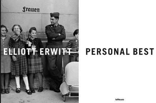
Elliott Erwitt - Personal Best
|


|
03/11/2016

The Americans - Robert Frank
|
The AmericansPossibly my favourite photo book of all time is 'The Americans' by Robert Frank. A highly influential book of post-war America, it was first published in France and then later on published in America. Despite how much I would like to talk about the greatness of the book itself, I am going to talk about the layout of it. It is so simple but yet so beautiful and it is a layout I am considering for my own book. I was once told that you follow a photograph from left to right, regardless of how the photographer wants you to see it. I think it is the same with a photo book. You will always look left first and then right after. I think Frank has put the writing on the left on purpose so that you know exactly what you're looking at before making a judgment. If the photograph was however on the left hand side an then the writing was on the right we would make a judgement of the photograph and the subject and then we would actually realise what it was before hand but still retain our judgement. I like how we only see writing on one page with a blank page, this helps us not to be distracted. i also like how the picture takes up an entire space on the right hand side and is usually perfectly in line with the last page. I will definitely use a full page for my front cover, like Frank has done in this book and I will try and play with lines in my photograph, as the windows from the bus act as rulers for the title.
|


|
01/11/2016
Lowedges first shootI have finally completed my first shoot in Lowedges after visiting family and friends there, I decided to take my camera out in to the area and shoot with a friend and his brothers. The two brothers that I photographed are twins and are typical young boys off of Lowedges; cheeky. My friend is somewhat a typical teenager off of Lowedges also. Although not 'chavvy' my friend falls in to certain Lowedges stereotypes. I photographed a few straight landscapes of houses, shops and rubbish bins and I also shot quite a few portraits of my friend and his brothers. however, I only shot 1 portrait of a stranger and only shot a few of people I didn't know. I did actually really like this shoot and I think it represents Lowedges in all of its beauty. i think the the portraits of the twins are really strong. I shot using an 18-55mm lens and most of the portraits shot are shot at 18mm and give a more 3D effect than a telephoto lens would give. i think that shooting at such a close focal length helps to get an insight into the lifestyle of children in Lowedges. I will hopefully get out again soon and photograph more people that I do not know. I am hopeful of about 10 portraits of people, as the majority of people on Lowedges are really interesting looking and I think that they would photograph extremely well.
|

|


|
30/10/2016

|
Photo booksOver the last few years I have acquired a fair few photo books and I have picked my favourite three to analyse. 'The Americans', 'Personal best' and 'The North' by Robert Frank, Elliott Erwitt and John Bulmer. I think that the most important things in a photo book (apart from photos) are both the layout of images and text, and also the text to accompany the image. I think that all of these books do this brilliantly. Although they tend to have very short captions, I think that the introductions and the layouts of each page help the book develop a really good narrative. The books include mainly pictures of people but they also have landscapes that help the reader understand the place the people are being photographed in. In my photo book, I will look at all the books I have and then develop an understanding as to how I want to lay mine out. There will be images that I want as a double page spread and also images that I want to take up only a half page. I think that I will write a little more than these books do about my images. Although the images should tell the story by themselves, I think that accompanying text can help a story develops its full potential in a narrative. i think that I will be staying with colour photography and keep every image in colour instead of black and white. I think that you must keep an edit either in colour or in black and white because a mixture of both can ruin it in my opinion.
|


|
29/10/2016
LowedgesSo this is Lowedges; my home. I have lived here for 19 years and I wouldn't change it for the world. It is full of council housing, flats, chavs, rubbish, broken windows and everything else that springs to mind when you think 'lower class industrial England'. It is somewhat the picture perfect place of Sheffield. I have decided that I want to do a project here as so many great photographers have photographed their home and their family and have had incredible stories to tell about it. I would like to document the place exactly how it is and not manipulate the images. I will walk the streets of Lowedges and photograph what I think Lowedges is all about. In terms of photographing people, I will photograph friends, family and also people on the streets who I feel fit in to the stereotype of Lowedges. I think that I will be shooting flat landscapes of all of the buildings I can find and then either photographing portraits of people or me. photographing people getting on with their every day life without them noticing me. Either way, I am really excited to see how my project works out, as the place is close to my heart and I would love to produce a book of it so that I could remember it for the rest of my life.
|

Photos: Google Images
|


|
27/10/2016

http://www.martinparr.com/recent-work/recent-work-3/
|
Welcome to BelfastI have always had an odd relationship with Martin Parr, as sometimes I really like his work and sometimes I despise it. Regardless of this, I have found a project that I both like and I also can relate with the project I plan on doing. Parr, regardless of what people think of him always seems to bring the best out of a project on a certain place. He always seems to be able to show what the place he is photographing is actually like. This is a project all about Belfast and in true Martin Parr fashion, he photographs people and places and also introduces a lot of colour into his images. I have chosen this project because Belfast tends to be quite a run down area and the people in it are... interesting. This is the same as the place where I live in Sheffield. I have looked through a few of Martin Parr's project and the way he photographs certain places are the way I would like to document my home (without the saturated colour). He somehow manages to engage with so many people and nobody seemingly gets angry with him. I will continue to look at Martin Parr's work along with other magnum photographers as I like the way they photograph certain things. Parr documents things for how they are and this is something that I want to do with my project. Lowedges is a run down area with interesting people in it, just like Belfast.
|


|
25/10/2016
Some Liverpool KidsTricia Porter photographed in the streets of Liverpool during 1974 and it is quite similar to the project I would like to produce of my home in Sheffield. I think that she documents the children and the culture very well for the time frame she is shooting in. She also captures the industrial side that the north was facing during the 70's. I am planning on showing for a 2nd project during this module on Lowedges, which is a small part of Sheffield that seems to have been forgotten about by the council. I have lived in Lowedges for the majority of my life and have grown up playing football with glass bottles and riding broken bikes on the road. I think that Lowedges would be a perfect project to represent the economic downfall of Sheffield and also how the government seems to forget about poor places and poor people. Al though Lowedges is quite frankly not a very nice place, it has been my home and I wouldn't change it if I had the choice. I would like to document Lowedges to show how the lower class live; I think that I could make this project work as I have a good relationship with a lot of people still living in Lowedges, whereas if an 'outsider' came and tried to document it, it may not be as good. I will be shooting in the next couple of days and plan to shoot some of the people I know and also some of the industrialised areas that still exist in Lowedges today.
|

http://www.porterfolio.com/some-liverpool-kids-1974-page/
|


|
23/10/2016

|
Stow Horse fair shootI decided to photograph at Stow Horse Fair so that I could find some people in hats for my project on stereotypes and perspectives. I shot on both a medium format camera and a DSLR. I found that this shoot went incredibly well, as i was feeling confident about myself and my photography this day and spoke to a lot of people and managed to get about 20 portraits of people. Although not all of the people I photographed are wearing hats, they all carry some sort of baggage and a story of their own. I managed to build up a big portfolio by going to Stow and it made me question wether I should go to events to photograph or simply head to the streets to find people for this project. I think that I captured the emotions of people exceptionally in some of my portraits. Particularly in the bottom 2. The woman on the left was very happy, she sat in her caravan all day laughing away and when i asked for a portrait, she was more than welcoming to me. On the other side of the story, we have the guy on the right who was reluctant to have his photograph taken at first but soon agreed after I used my persuasion skills to tempt him into a photograph. He didn't show any emotion and I think that this captured him perfectly. At the end of the day, he was a business man who had been through a lot in life and had traveled a lot. This photo makes him seem knowledgable and well-traveled, which I think captures him well. This hat project is going well so far but I am looking at developing another project alongside this one of my home in Lowedges, which is a run down area in Sheffield that is being overlooked by the government.
|


|
21/10/2016
Gaza one year after Hamas victory This is the Palestinian Prime Minister Isamael Haniyeh in an office of his Head Quarter in Gaza. With all that was chaotic in Israel at the time of these photos, there is something so quiet and beautiful about the portrait of Haniyeh. He is in his office seemingly relaxed, there are no distractions and no chaos. This documentary is all about Gaza one year after Hamas' victory. I wanted to talk about off topic things in this documentary and focus mainly on the headwear of the images in this documentary but it is hard to ignore everything happening at that time. Anyway... although I have talked about it a lot so far, it is so evident that hats actually carry stereotypes. While doing my research after my idea first developed, I was actually so shocked while sat thinking about it. You can digest everything about a person based on the hat that they are wearing. The bottom two images you can tell this the most, the man on the left is evidently a general of some sort in the army, whereas the guys on the right give off the sense that they are the 'enemy' of whoever they are fighting. But what if they are fighting for a good cause? We literally look at his headwear and we instantly think 'terrorist' or 'enemy'.
|

http://viiphoto.photoshelter.com/galleries/C0000fkIvh7elDPM/G0000OhCZg5GfX60
|


|
19/10/2016

http://tripmag.co.uk/stow-horse-fair/
|
Stereotype vs realityAre stereotypes and reality the same thing? Absolutely not. "all Muslims are terrorists". "All black people are criminals". "White people can't jump". Ridiculous.
I have decided to use Stow Horse fair as a challenge to stereotypes and reality because gypsies are massively looked down on in all communities. They 'apparently' steal food and drink, take over land and are genuinely aggressive. Here's the thing (rant time)... what is the perfect life? To travel... with friends... in a closely knit community... with great security... eat good food... play good sport... enjoy yourself and most importantly not pay tax!! In my opinion, gypsies live the definition of the American (English) dream. So the stereotype is that they are a bane on society and don't contribute as much as the ordinary person. Heres the reality - we all know that anybody offered the opportunity to travel all your life and have a huge pile of £50 notes in your wallet, they would 100% take that opportunity regardless Do we actually believe what we say about minority groups and religions or are we just, in our boring English way of living... a little bit jealous? I do think that stereotypes (especially racist stereotypes) are a massive problem in the English community and need to be challenged. I will be travelling to Stow tomorrow to photograph different type of portraits and hats within the travelling community.TWATt |


|
17/10/2016
RastafarianI found this article on Rastafarians that includes multiple different photographers takes on the Rastafarian community. I chose to blog about Rastafarianism because there is literally a 50/50 split on how people view them. Evidently there are one side that will argue that Rastafarians bring incredible music. food, style and culture, you just have to talk about Bob Marley and peoples faces will light up. Bob Marley potentially brought Rastafarianism to the western world as he inspired millions. However, people also look down on the lifestyle because of the drug culture they inherit. Marajuana to relax and become 'creative' is something they use a lot. I think the western world is quite disapproving of Rastafarianism or 'isms' as they prefer to be called because "The Rastafari movement encompasses themes such as the spiritual use of cannabis and the rejection of western society". I think that the stereotypes of some minority groups are absolutely ridiculous personally. I would like to challenge certain stereotypes in my hat project as it is unfair to judge people on their religion or culture.
|

http://abduzeedo.com/photography-inspiration-rastafari
|


|
15/10/2016

http://www.theinspiredeye.net/street-photography-portraits/
|
Why and how do we stereotype?How and why do people form stereotypes? The commonsense answer to these questions is captured in social learning theory. Simply put, we learn stereotypes from parents (our first and most influential teachers), significant others (e.g., peers), and the media. True enough. Research supports commonsense here but also indicates that commonsense does not tell the whole story. Another explanation for how we form stereotypes comes from research in cognitive psychology on the categorisation process. People like to, want to, need to categorise the world, both the social and physical world, into preferably neat little groups. Every person or thing that we see carries a certain stereotype and theres nothing we can actually do to stop these stereotypes occurring. We joke about stereotypes and we also take them seriously. We learn from an early age that certain people do this, and certain things harm certain other things. But when everything is said and done, are they actually true? Yes there are probably a higher percentage of certain people doing certain things but surely this is just coincidence? There is no way that the way we are born, the way we dress, the way we speak determines how we act in life.
|


|
12/10/2016
People in hatsThis idea came to me while shooting in Bristol. I was thinking about the different meanings and the different stereotypes various hats can carry. What do you see when you look at the guy in the top image that I took? A 'Rastafarian'? Somebody who smokes weed? I personally see somebody who seemed to be at one with himself, he was so incredibly happy just sitting on a wall. Maybe he is a Rastafarian, he certainly possess the features of one. What do I see when I look at the person the bottom left image? Negative or positive connotations? Some people may look at this and have negative thoughts, whereas others would have a different take on him. He was in Birmingham and could barely speak a word of English, but he is evidently a great practitioner of his religion. What hair is behind the hat in the bottom right image? There are so many questions asked simply because a person has a hat and there are so many different stereotypes behind hats. You see a young man on the street with a nike cap on? Thug. You see a woman in a fancy hat with flowers on? Posh. There are an incredible amount of connotations behind hats and it would be interesting to find out what people think about different hats.
|

|


|
10/10/2016

Richard Billingham - Ray's a laugh
|
Ray's a laughRichard Billingham is a British photographer who worked on a project to do with his family and his alcoholic father, Ray. The title of 'Ray's a laugh' is a play on words as well as an interesting title. It makes me think of 'raise a glass' as if to mock his alcoholism and also to actually claim that Ray is quite funny. I really like this documentary as it is so close to the photographers heart, it makes it more powerful. This also links with my project idea of photographing my home in Sheffield and documenting the surrounding areas, as it is quite a lower class area. The family itself looks like a very lower-class family and this is shown in Richard's story of them; the brown sofa, old wallpaper and just everything about the photograph screams 'low class'; I think this is why I like the project so much. In my project, I will look to photograph similar to this, but I will focus on the positives as well as negatives I think. This documentary portrays quite a sad message and shows Ray in quite a sad light.
|


|
8/10/2016
Bristol zoo shootI visited Bristol zoo purely for the day out, but I brought my 70-200mm lens to try and snap some wildlife photography. At the time of my visit, The lions were very close to the edge of their enclosure and one was protecting its perimeter by walking up and down and roaring every so often. I photographed their faces mainly and they looked quite sad, in one case they even looked as though they were crying. I'm really interested in photographing at the zoo and I have emailed them requesting to speak to the lion keeper so that I could do a closer documentary on the lions and the lion keeper, as it really interests me. The zoo have got back to me saying they will try and sort something out so I'm just going to have to wait until they find something for me.
|

|
|
05/10/2016

John Bulmer - The North
|
The NorthI recently purchased a book in Newcastle titled 'The North' by john Bulmer; it struck my eye, as I am from the North and all my family have been for the past 3/4 generations. I bought this book not knowing of the photographer nor the book; however, after looking through the book, I felt as though it captured my parents and grandparents era so amazingly well. The North has always been known to be incredibly industrial, and is also known to be 'screwed over' when Margaret Thatcher was PM. Although The North (mainly shot in Manchester and South Yorkshire) documents the daily struggles and also documents how lower-class people were there, in almost every image I could find, the people in it were happy, and this makes me happy. Being from Sheffield, it is common to see people, and it was actually voted the 'happiest city in England' in 2014. This project, after only capturing my eye for the title has, within 2 weeks is slowly becoming one of my favourite books, it captures what it was entitled to do so perfectly, and highlights both the good and bad side of a lower class scenario. I also particularly like the bottom right image, as it relates to the miner strikes, and also clarifies how hard working and industrial The North is.
|


|
03/10/2016
Family LoveDarcy Padilla documented her own family for over 10 years; 1993-2014; and she captured both the good times and the bad times of her family. I really like this project as the subject is evidently really close to the photographer and makes for a much better story. I like how the photographer has included various different characters in this story because it gives an overview of everybody in the family. What I personally enjoy about this project is the level of emotion shown in each photograph; especially the bottom right image, it almost looks as if the father is protecting the mother for some reason. Also, the top image shows that the woman in question is actually quite sad and the fact that she smokes indicates a sense of stress. In my project I will look to get close and personal to my subject(s) and produce intimate, emotional images. I will definitely focus on emotional parts when I shoot my project as well as the happy parts, because I want my story to be powerful for its audience.
|

http://www.worldpressphoto.org/collection/photo/2015/long-term-projects/darcy-padilla/30
|


|
01/10/2016

Andi Schreiber - Wonderlust
|
WonderlustAndi Schreiber is what one might coin as a domestic Martin Parr. She turns her camera on her life, her children, family and friends with a glaring lens that is full of color, reality, and the details of our humanness. There is humour and pathos in her seeing, and her skills as a photojournalist bring domestic life into focus.
"WonderLust is a visceral response to my immediate surroundings – a world where I’m at home yet hovering on the periphery, an insider and outsider at once. Through these images I find my place within my family’s framework and that of a larger existence." I really like this project, as it links to every day life for most people. Photographing for the 'I', instead of the 'Other'. Especially the top image, which shows what looks like the after effects of a party; snacks, alcohol and a lot of mess. The bottom two images, assuming that they are her kids, shows the every day life of a young child. I think that she documents the normality of life perfectly in this project. It is also close to her heart which shows in the images. |


|
28/09/2016
1 in 8 millionSarah Kramer and Alexis Mainland photographed a series for the New York times called '1 in 8 million' - similar to the 'Humans of New York', this documentary series tells much more of the story. The series of photographs are placed on a website with the subject talking over them as they play. The photographer evidently have a huge relationship with their subject and therefore have this connection in their photographs. In the bottom right corner, the man in the image talks about how he had to wear a tie to school, and then goes on to talk about different types of ties and events, most notably a male at a wedding and how 'poor' he is because the female gets everything, and is prepared 2 years before the wedding, whereas the man gets only a tuxedo and is only prepared 2 weeks before. There are so many characters in New York that you'd probably fail to see most of them if you were to walk down the street. this is similar to every place in the world, if I were to walk down Cheltenham high street, how many people would I actually pick out and think "I want to photograph them"- not many. Everybody has a story and I must open my mind slightly to this point.
|

http://www.nytimes.com/packages/html/nyregion/1-in-8-million/
|


|
27/09/2016

Eddie Adams - Saigon execution
|
What are documentary perspectives?They have the remarkable capacity to shift our understanding of the vast and complex world in which we live, most of the time presenting us with powerfully relevant information, a previously unknown perspective, and hopefully, a new choice to make a difference. The way we perceive things in the media determines wether or not we want to make a difference and in the case of photography documentaries, this is sometimes the case. Take for an example a documentary I did last year on a homeless man called Moz, my photos, along with a 'gofundme' page managed to raise £2,500 for the homeless community. Potentially the biggest and most powerful documentary photograph taken was that of Eddie Adams during the Vietnamese war with his photograph 'Saigon execution' he is said to have single handedly stopped the war as people started to see how gruesome it was. Our perspectives on documentaries can give the opportunity to change the world, depending on how we react to the message being portrayed in those images/ videos.
|

